J Prince

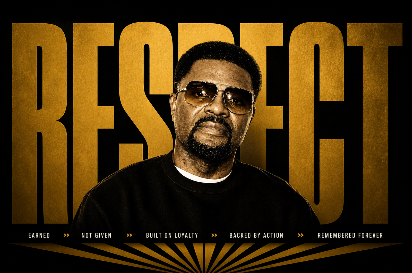
THE STORY - J Prince had already built one of the most respected names in music, business, and culture before stepping into boxing. The identity needed to carry that same legacy not borrow from it.

The Evolution of Authority

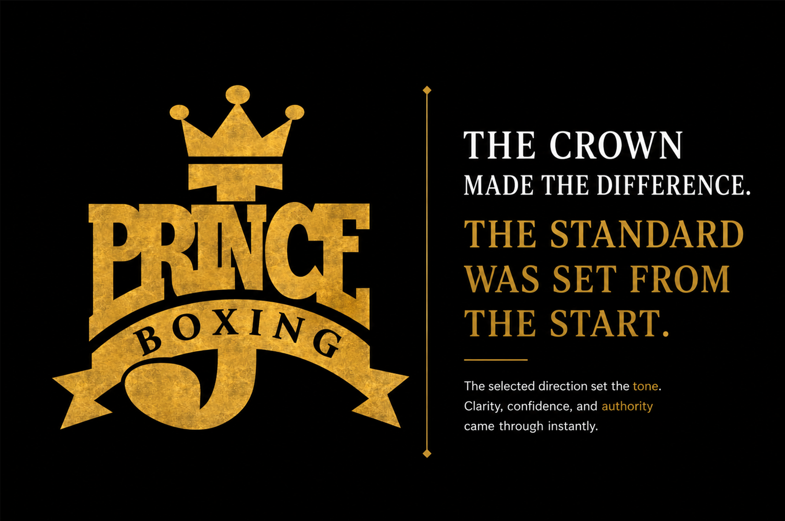
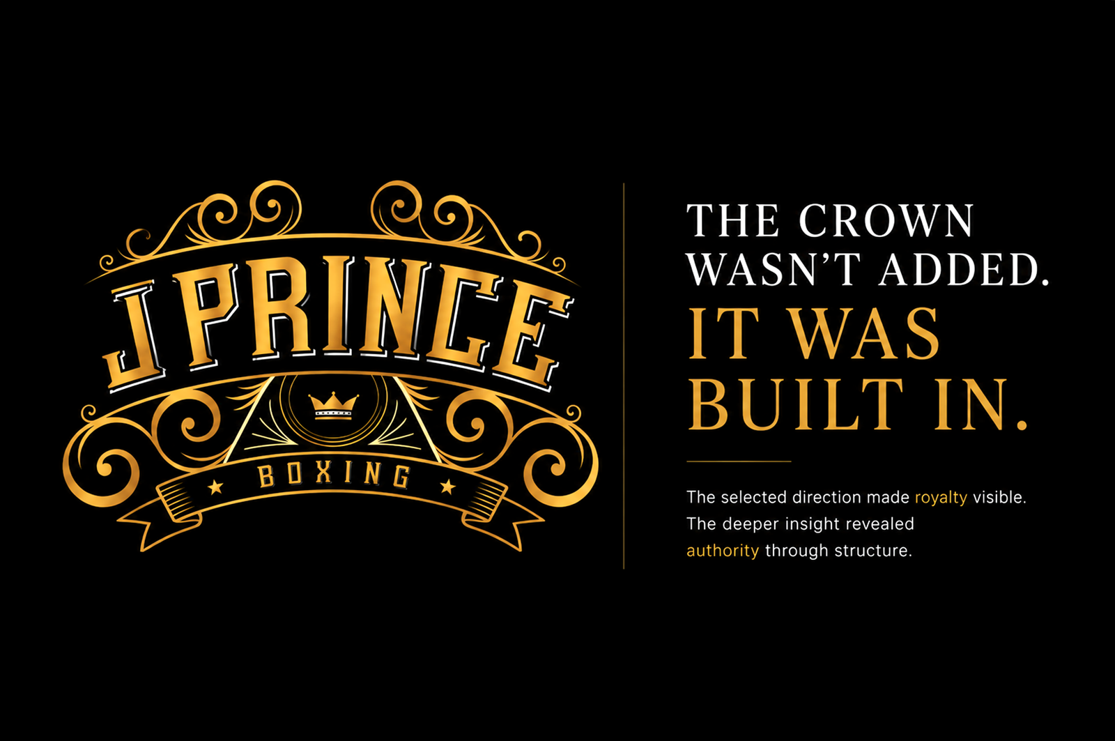
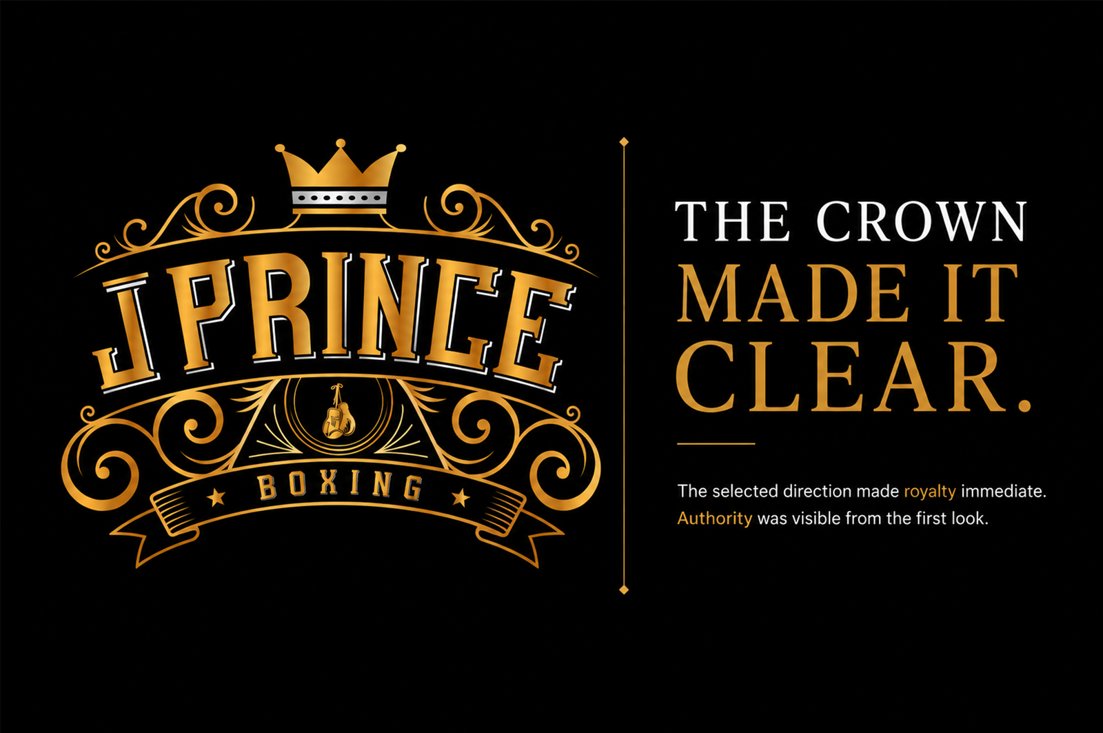
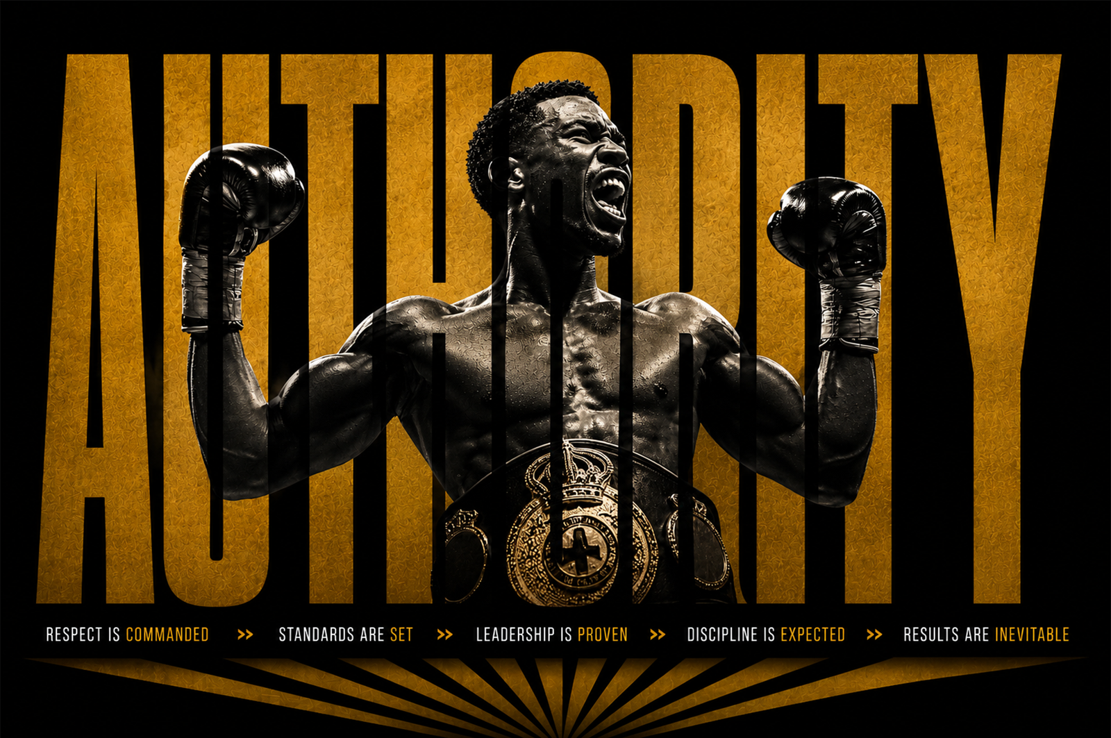
J Prince Boxing already carried the instinct of royalty, legacy, and dominance. The selected direction made that message immediate through a visible crown. But in the exploration process, another insight appeared: authority could also be built into the structure of the mark itself. That contrast became the clarity — one crown was seen, the other was discovered. Both revealed the same truth: this identity needed to command respect.


The Problem The original identity had instinct but lacked the authority and refinement that the name behind it had already earned. There was a gap between the brands visual presence and the weight of the man it represented.

j prince boxing

The Clarity

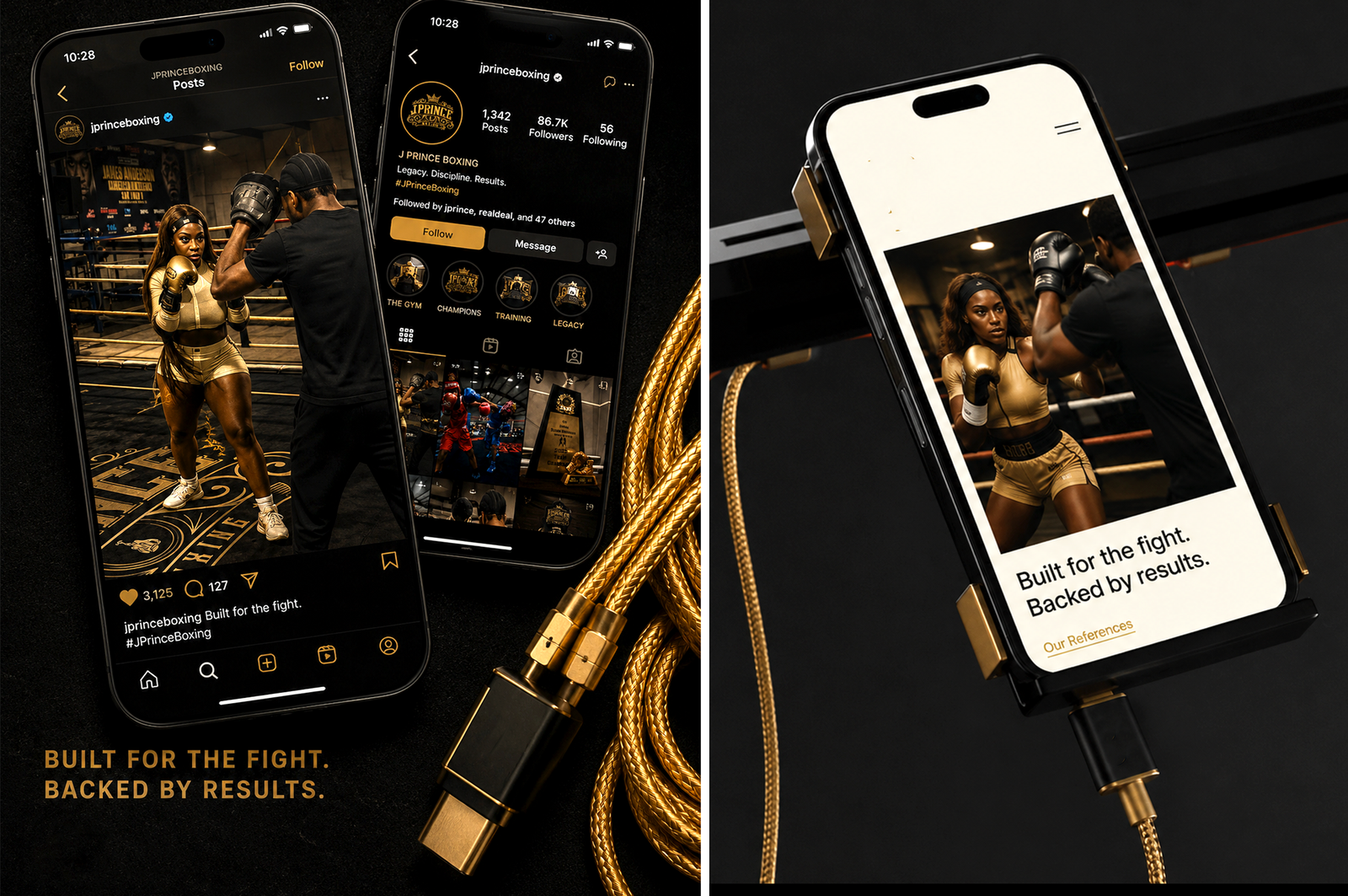
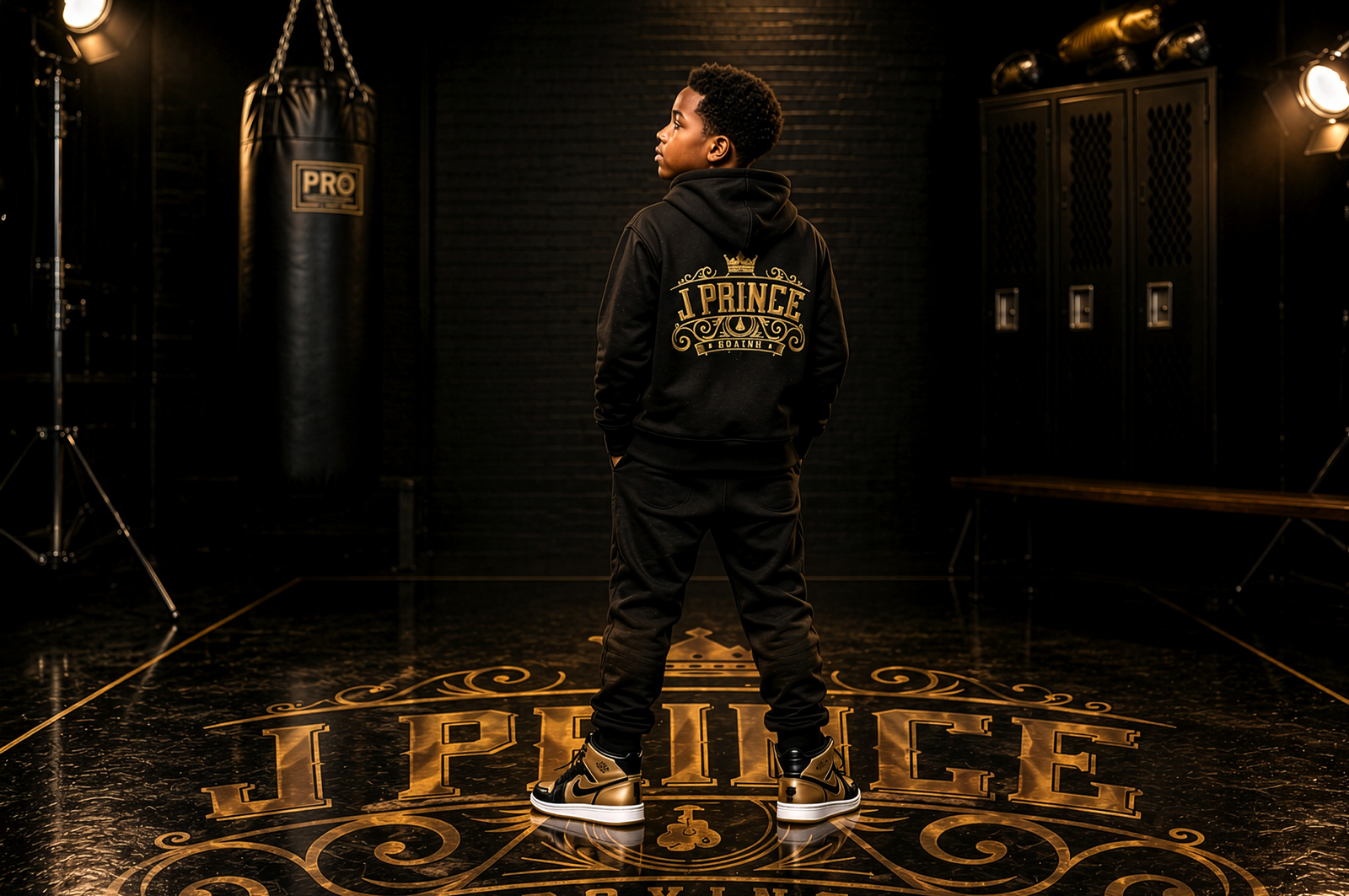
Defining the brand’s core authority, structuring a heraldic identity system rooted in royalty  and permanence, and advancing it into a complete visual language through refined gold detailing, dimensional crest work, and stratejic positioning. The result was a brand that didn’t just look the part – it commanded it.

The Transformation

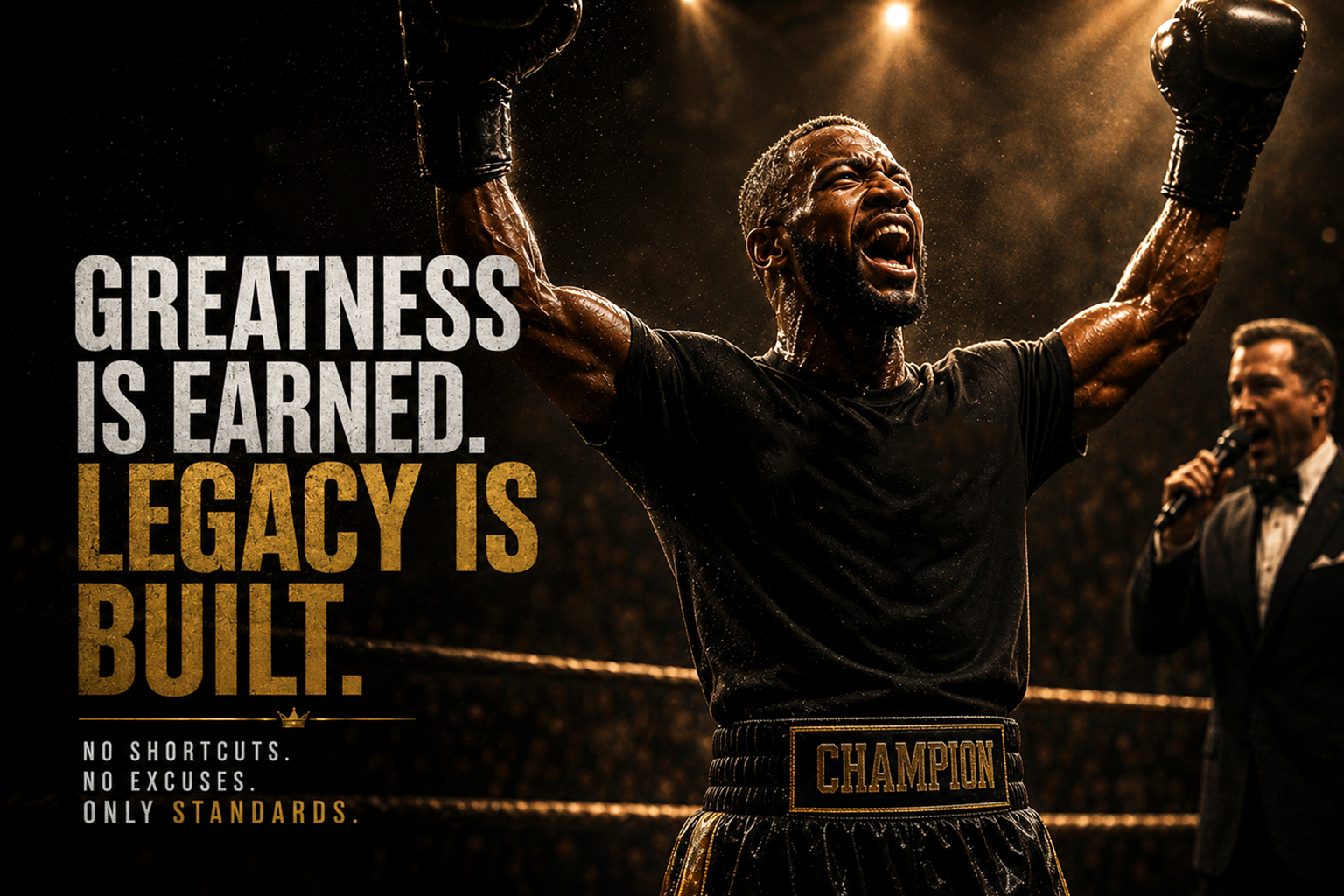
J Prince boxing now carries the same discipline, presence, and authority as the legacy behind it.